A font is a formal set of text characters, including letters, numbers and punctuation, created by a graphic designer in a particular style. Not all fonts are created equal and some typefaces may be more or less accessible for readers with visual impairments, visual processing disorders and dyslexia. For example, Dyslexie font is a font designed specifically for dyslexic readers. OpenDyslexic was also designed for people with dyslexia. Additional factors such as letter spacing, the spacing between words and lines on a page, font size, text color and background can all affect readability and reading speed.
For students who are developing literacy skills at school, it’s important to work with text that is easy to read—especially when it comes to composing written work on a computer. If dyslexia is an issue, letters that look similar may be confused or fonts with too much visual noise can cause stress and interrupt reading (1). For this reason parents and teachers may wish to expose a child to various dyslexia-friendly fonts and make adjustments based on the child’s preferences.
It is also possible to change computer-displays and word processors to reflect an optimal typeface for every student. Keep in mind there are many different kinds of dyslexia so there is no one size fits all dyslexia font.
Some fonts are more readable than others
Letters differ in their design, including their height, weight and shape. Families of fonts are referred to as typefaces and come installed on word processors. The most common typefaces for online materials are sans-serif fonts that lack any special flourishes at the end of strokes and have a modern and simple look.
Consider the capital letter E which can have a serif or vertical line at the end of the middle bar. Sans-serif fonts would not include this line and are therefore more streamlined. They also tend to be more dyslexia-friendly than other typeface families.
As the British Dyslexia Association explains "Some dyslexic people have expressed strong feelings about typefaces, but there is no agreement apart from saying it should be sans serif."
Verdana is an example of a popular sans-serif font that was created for Microsoft Corporation and intended to be easy to read in a smaller font size and on lower-resolution screens.
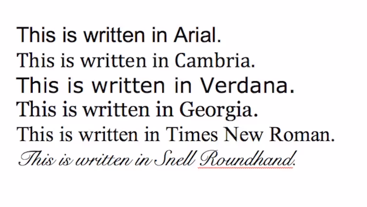
On the other hand, fonts like Georgia and Times New Roman are often harder for people with dyslexia to read given they have tails and other features that complicate the basic letter shapes. Fonts used for printed material can vary depending on the design and the text’s purpose and you may find different typefaces are more commonly used for headings or body text.
The familiarity of a reader with a font is one factor that influences readability. Typefaces that are more commonly encountered may be easier to process. Nonetheless, individual differences in readers, such as the presence of a specific learning difficulty, can also affect readability.
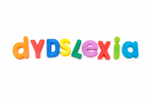
What is dyslexia?
Dyslexia is a language-based specific learning difficulty or difference that affects the way an individual processes language. Dyslexia can look different for everyone and no two individuals will have the same collection or severity of symptoms.
Nonetheless, dyslexia often makes it harder for individuals to split words into their component sounds, affecting decoding skills in reading and spelling. If left untreated, it can cause a child to fall behind his or her peers at school.
Fortunately, there are plenty of strategies and classroom accommodations that can help dyslexic children overcome the challenges associated with developing literacy skills and achieve their full potential at school.
Learn more about dyslexia in these articles on classroom accommodations for dyslexia, spelling strategies for students with dyslexia, strategies for dyslexic readers and motivational quotes for the dyslexic students.

What makes a font dyslexia-friendly?
While the majority of fonts were designed to be aesthetically pleasing, there are some dyslexia-friendly options that were created with functionality in mind. People with dyslexia often struggle to differentiate certain pairs of letters, but by changing the height, weighting and center axis of a letter, you can make it look different. It’s also possible to put it on a slant and adjust the empty space to help differentiate it as a shape. For example, letters built out of circles may have wider openings added and the bits that go up and down on some letters, commonly referred to as extenders, can be lengthened.
By making each letter unique, graphic designers reduce the chance that one letter will be mistaken for the other during reading. This works especially well for mirror letters like b/d and p/q. It also helps for the letter l and the number 1, f/t and a/o/c.
Sometimes a dyslexic reader will confuse letter combinations such as rn for the single letter m. By changing the curve of the arch and adjusting the r’s width, designers can reduce the likelihood that this error will occur.
Certain fonts also render capital letters and punctuation in bold to enhance their visibility. These adjustments may help students who struggle with visual processing disorders as well.
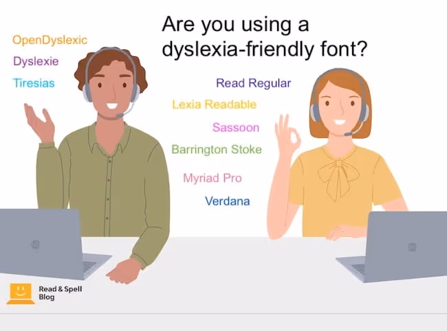
Fonts for dyslexic students
Keep in mind that different fonts work better than others at preventing certain kinds of errors so the best font will depend on the preference of the dyslexic individual who will be using it.
Dyslexie
Designed by Christian Boer who is himself dyslexic, Dyslexie font was created in the Netherlands as part of a thesis project.
OpenDyslexic
Alberado Gonzalez is a graphic designer who based this font on DejaVu Sans. It has since been used in several eye-tracking studies.
Lexia Readable
This is a free option with good differentiation between the letters b and d.
Read Regular
While not expressly designed for people with dyslexia, this is a common font used by children’s book publishers. It was created at the Royal Art College.
Tiresias
This font is for people with visual impairment and hasn’t been tested specifically for dyslexic readers.
Sassoon
While highly recommended, Sassoon must be purchased and can be expensive.
Other dyslexia-friendly fonts
Additional options include Barrington Stoke, Myriad Pro, which is a very clean font and Century Gothic, which has geometric letters that can make reading easier in the same way as text written in all capital letters does.
What the research says
Some researchers have tried to validate dyslexia-friendly fonts by studying reading when text is printed in different styles. A common method is to employ an eye-tracking machine which records how the reader moves through a piece of text, navigating different words, speeding up, slowing down and going back to re-read bits.
Unfortunately, no direct evidence has been found regarding the benefit of any one font (2) --although they have found that children learning to read benefit from larger text sizes. This may be due to variability among participants and hidden variables, such as familiarity with typeface. For example, one study found that the control font was read one word-per-minute faster than OpenDyslexic, but Arial is a fairly common typeface that participants were likely to have used in the past (4).
Studies have also found that adjusting letter-spacing increased reading speeds and decreased errors in children with dyslexia (3).
And while speed is an important factor, so is accuracy and reading comfort. If a dyslexic-specific font can make the process of reading more enjoyable, it will help children stay motivated when reading is a struggle.
Tips for parents and teachers
- Install new fonts and try them out. Many of these fonts, including Dyslexie, OpenDyslexic and Lexia Readable are open source and free to download.
- Print classroom materials in dyslexia-friendly fonts. You may wish to use a dyslexia-friendly font for all of your classroom materials, particularly if the other students in your classroom react positively to it.
- Consider typeface when selecting print-only books. Different publishers may have a preference for certain typefaces. Consider font in addition to elements like vocabulary and story length.
- Adjust line spacing and color on worksheets. Use 1.5 line spacing and print worksheets on different colored paper to prevent students with specific learning difficulties from losing their place. You may also try using bullets, bolding and other text features that organize information and make important sections stand out.
- Teach students how to make adjustments to word-processors. Have dyslexic students adjust their word processor until they find settings that make reading easier for them. Teaching them to make these adjustments themselves will mean they can use the same configuration at home and at school.
- Look for accessibility options on websites. Some websites, such as Wikipedia, will allow you to change the font used throughout the pages to make text accessible to more readers. You may also find other custom presentation features.
- Download a browser extension. There are certain browser extensions that will allow you to change the text you are reading on various webpages to a dyslexia-friendly format.
Typing vs. handwriting
Writing by hand can be tricky for students who struggle with dyslexia. They may waste a lot of time worrying about spelling or have trouble reading their own writing. For students with dysgraphia or dyspraxia writing by hand can actually be physically painful in addition to frustrating.
That’s why teaching kids to touch-type is often recommended. In this way, they can harness muscle memory in the fingers to help with spelling and have access to different fonts in which to proofread their work.
Discover a typing program for individuals with dyslexia
The Touch-type Read and Spell program is a dyslexia-friendly tool in which students learn keyboarding skills using a phonics-based approach. It’s delivered in a multi-sensory way as students see letters and letter combinations, hear their sounds played aloud and type the corresponding keys.
TTRS helps to strengthen decoding skills and the inclusion of high-frequency vocabulary also gives kids an advantage with sight-reading. It offers a choice of fonts.
Share your experience with us
Do you have dyslexia? Which font do you use when writing on the computer? Are there any fonts you know you struggle with? Leave us a comment in the box below to let us know.
Are you a teacher? Which font do you commonly use for your printed materials? Do you have any tips to share with other educators on selecting the best typeface for the classroom? We look forward to hearing from you.
References
- Blau, V., Reithler, J., van Atteveldt, N., Seitz, J., Gerretsen, P., Goebel, R. & Blomert, L. (2010). Deviant processing of letters and speech sounds as proximate cause of reading failure: a functional magnetic resonance imaging study of dyslexic children. Brain, 133(1), 868-879.
- Kuster, S., van Weerdenburg, M., Gompel, M. & Bostman, A. (2018). Dyslexie font does not benefit reading in children with or without dyslexia. Annals of Dyslexia, 68(1), 25-42.
- Zorzi, M., Barbiero, C. Facoetti, A. Lonciari, I., Carrozzi, M., Montico, M. Bravar, L., George, F., Pech-Georgel, C. & Ziegler, J. (2012). Extra-large letter spacing improves reading in dyslexia. Proceedings of the National Academy of Science, 109, 11455–11459.
- Wery, J. & Diliberto, J. (2017). The effect of a specialized dyslexia font, OpenDyslexic, on reading rate and accuracy. Annals of Dyslexia, 67(2), 114-127.